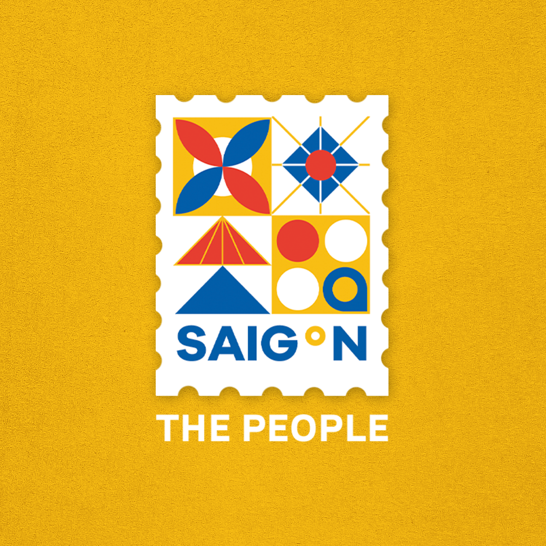
The Mark of Saigon
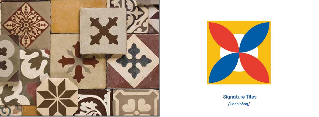
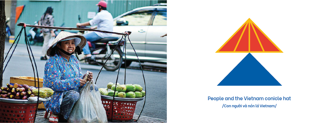
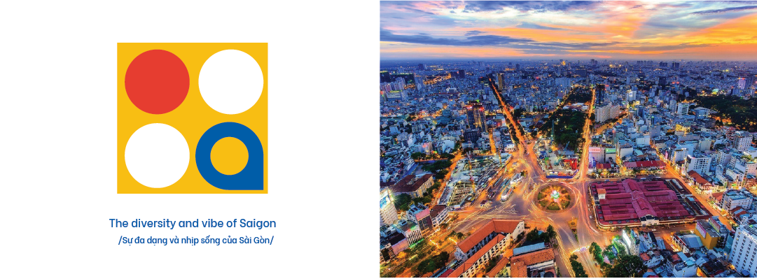
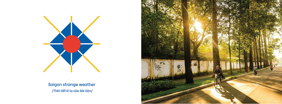
Design of branding and stationery for the city for the Ho Chi Minh city tourism office featuring the vibrant and dynamic characteristics with its iconic look. Inspired by the significant influence on Art Deco, the brandmark created from 4 illustrative blocks of the textiles, a conical hat, a close connection in the community and the iconic weather states.
As Saigon is a fast developing and digitalising city, a semi-monospace type is used. The project including an animation of the logo that adaptable on any billboards or digital platforms.
The identity is expanded to different media to see how it adapt and represent aspects of the city. With a bit of rustic and grain texture, it gives how Saigon actually felt like with the French architectures and dynamic vibe.


See how it moves
To enhance the spirit and vibe of Saigon, I have added the music element so that viewers can have a clearer look and feel of the city.
Song: Sai Gon Dep Lam by Phuong Vy